Imagining a world without colour is likely to evoke feeling of drabness or monotony. The absence of colour removes a useable response from the human brain that would normally give us a feeling like happiness, excitement, sadness, fear, positivity etc. This has been researched to some length and the human response is one that is chemical from the wavelengths of light that enter the retina all the way to the visual cortex of the brain (and various other places).
Consider the following:
- Why does daylight wake us up in the morning (especially blue/ green)?
- Why is the colour red perceived as ‘danger’?
- It is thought that blue light can make us calmer whereas red light makes the heart beat faster
The examples of how human responses are attributed to colour goes on and on. We can be green with envy. When we are sad, we are blue. Warm colours like red, orange or yellow are said to evoke feelings of warmth and comfort but also anger and hostility. Cold colours like blue.
THE MEANING OF COLOUR
The father of colour psychology, Carl Jung, set in motion experiments and research that gave rise to some basic rules about human interaction with colour:
- Colours have meaning
- Human perception of colour is either biological or learned
- A person’s perception of a colour leads to an evaluation of that colour.
- The evaluation of colour caused a resultant behaviour
- The influence of a colour is automatic
- Context affects the meaning of colour.
Heavy stuff…

COLOUR IN THE WORKPLACE
So, it seems sensible that colour in the workplace should be carefully considered when buying furniture or decorating a workspace. This is another area which has been studied of course. Here are some examples of how colours affect the work environment and the staff within:
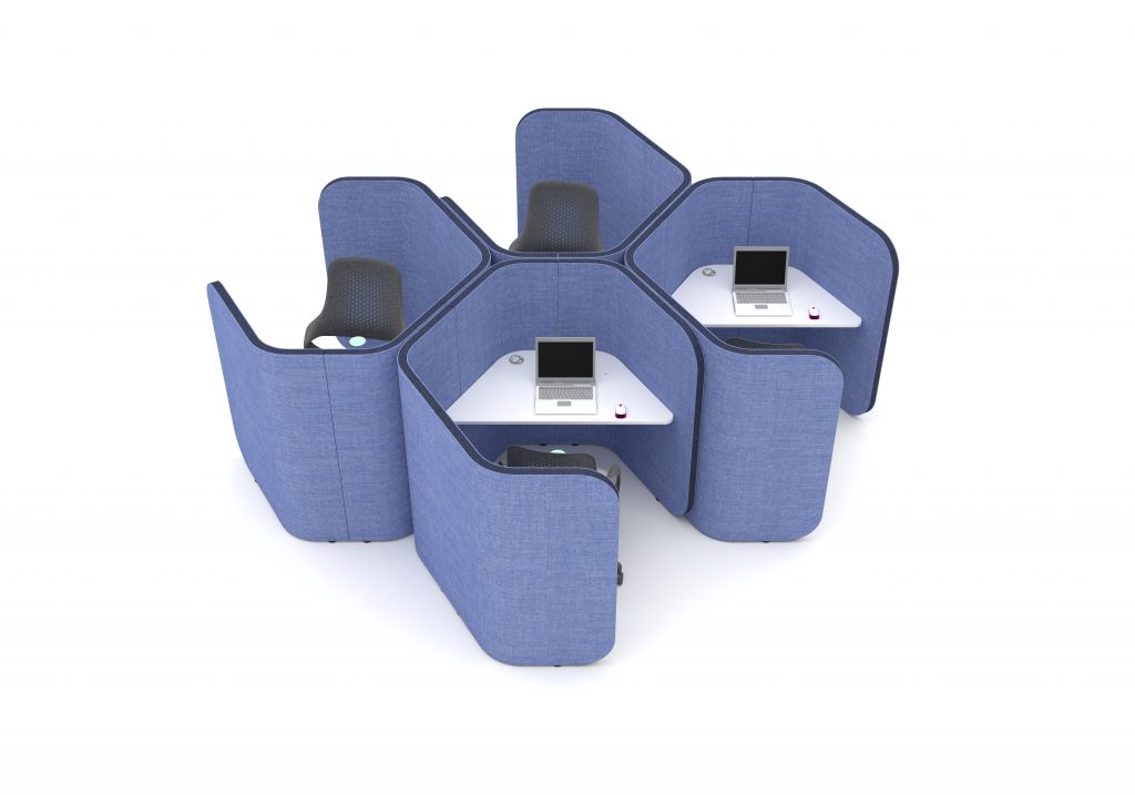
- As mentioned, green and blue evoke feelings of calmness. Therefore, walls that are painted in these colours can help employees to focus. The same could be said for furniture too. A blue or green acoustic screen around a desk could help reduce anxiety and be valuable for those who work at a computer screen or have below optimal lighting. Darker shades of blue and green should be avoided as they evoke feelings of sadness.
- Yellow and orange can make someone feel happy (just like sunlight) but decorate a workspace with too bright a shade and people can start to feel anger, frustration or even hunger! A bright shade of yellow or orange can cause eye strain which creates irritability.
- Red is viewed as an exciting colour that can stimulate employees. Red can tangibly increase heart rate and brain activity. To avoid over-stimulation, red is best used as a secondary tone to a calmer colour.
- Pink is a viewed as a very calming colour but is not considered a good fit for a thriving and productive office as it can evoke feelings of homely relaxation and cosiness.
- Although not particularly stimulating, white can be a colour that causes eye strain. White gives the impression of cleanliness and sterility.
SOME GENERAL RULES
- Use cool colours in areas where employees or clients benefit from calmness or appreciate focus.
- White is best used for clinical areas like hospitals, clinics or technical spaces.
- Red can be used as a secondary colour for workspaces requiring creativity and as a primary colour for areas where staff do not remain (corridors, restrooms etc)
- Study areas or libraries such as University facilities would benefit form an olive shade of green as this stimulates concentration via reading or studying.
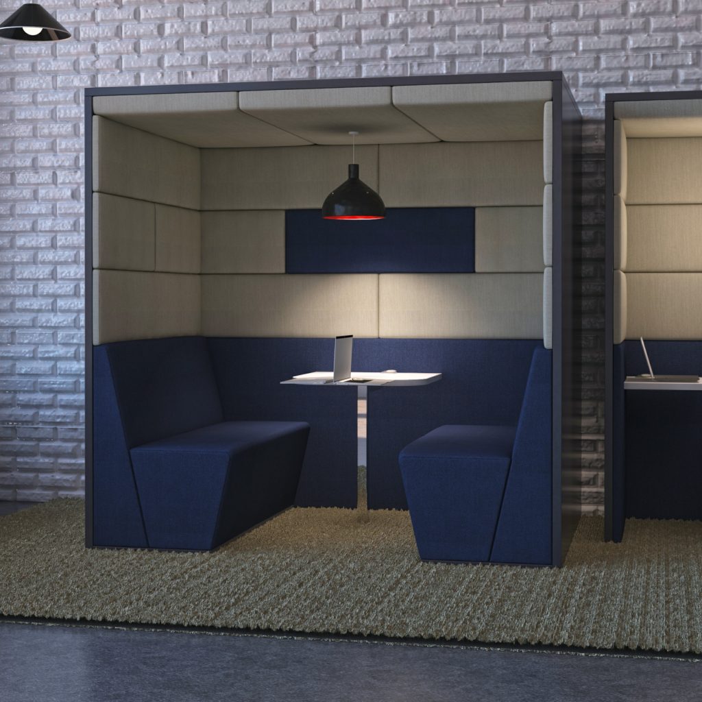
- When choosing the colour of your furniture and décor, always consider what mood you would like your employees and clients to experience.

